by Timothy Martin, CEO and Editor-in-Chief read it |
|
|
| about us |
 |
||
| Color & Lighting I by The Reverend Bob "Bob" Crispen This is the first in a series of tutorials on Web3D -- the technologies that are making 3D on the net and 3D communities on the net possible. Right now the overwhelmingly most successful immersive 3D technology on the net is VRML, Virtual Reality Modeling Language. Since VRML browsers are plentiful and mostly free for nearly any platform, and since I want you to be able to start to practice what you've learned right away, I'll focus on VRML for now. But I'll keep in mind the up-and-coming technologies like X3D, which I'm following closely. That way, we won't waste too much time together on things you'll have to unlearn with the other technologies. Today's lesson is absolutely basic for 3D. Whether you're using VRML or POVRay or any 3D technology you can think of, you'll need to light and color whatever you create. Let's begin with the real world to see how Mother Nature does it...
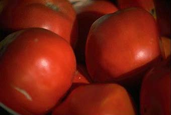
The apples [1] in this image look so good you can understand why Eve got into all that trouble! What color is it? Let's begin by asking a very basic, yet very difficult question: what color are the apples? If you haven't studied painting or perceptual psychology, the answer is easy. The color is right there in the picture. But where in the picture? Well, let's take that image into our favorite 2D bitmap graphics editor and take some samples and see what we're looking at. Here are a few of the samples I got when I did that:
All the colors I sampled came directly from the red part of the apples themselves. So are all these colors (and the dozens of others in the image) the color of the apples? That's silly. One of them is a lot closer to what we mean when we say "that's the color of the apple." If you thought the sample in the middle was pretty close to the color of the apples, you're like most people. The apples, after all, are red, not pink or salmon or cranberry or black. But what do you mean "the apple is red"? Is there something in the center of the apple that shows through, no matter what the color is on the surface? Absolutely not. As you can see from the little nick in the lower left-hand corner of our original picture, or from cutting an apple yourself, the apple isn't red inside at all. The color we're talking about is very definitely on the surface. But all the colors I sampled are on the surface. Which of them is the color of the apple? Let's talk about where I got that middle color and see if that leads us anywhere. I sampled that color not from the highlights, like the colors on the left, or from the deepest shadows, like the colors on the right, but in between them -- where the lighting shining on the surface was neither concentrated nor mostly absent, but diffuse. And that's the answer: whenever we're talking about the color of an object in ordinary conversation, we're talking about the color we'd see under even, diffuse lighting. That's called diffuse color. diffuseColor (to use the VRML notation) describes that color with 3 parameters: red, green, and blue. That isn't the only way you can specify colors. People who do a lot of color printing often use cyan, magenta, yellow and black (CMYK) instead of red, green, and blue (RGB) to specify a color. You may have seen some settings in your favorite 2D bitmap graphics program that let you specify colors using hue, saturation, and value (HSV), and you may have even seen some 3D representations of colors. But since most of your audience will see the picture on a monitor that has a red, a green, and a blue color gun inside, it turns out that RGB is a pretty reasonable choice. So let's try out VRML's diffuseColor parameter in a VRML world and see how it turns out. A couple of minutes on that middle sample in my 2D graphics program and with a calculator converting from 0..255 to 0..1 (the scale used by VRML and most 3D technologies) shows that we should have a diffuseColor something like[2]:
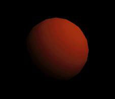
So let's look at our first example world with these colors. If you click on the image below you'll see something like it in the VRML browser you've got installed as a plugin or control for your Web browser:
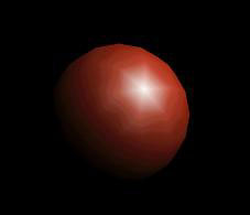
So far, so good. The area that isn't immediately under the light (which will be one light, shining from just above your right shoulder, in all our examples) or deeply in shadow is a nice dark red. If you like your apples lighter, go ahead and pump up some of the color values and see what you get. This world is simple enough that you can easily take it into a text editor and fool around with the color parameters without getting lost. Right-mouse (PC, Unix) or mouse and hold (Mac) to save the image to your hard drive and edit it in any plain text editor (not a proprietary-format word processing program like Word). On PCs, Notepad will be fine for our examples. One more thing before we finish with diffuseColor. Notice that the areas that aren't being lit by the light are dark, almost black, while the areas pointed toward the light are light. If we added another light to the scene that was pointed in a different direction, we'd see two light areas on our sphere. So diffuseColor, all by itself, can give you a pretty good illusion of 3D. Many VRML worlds and other 3D objects out there never use any other kind of color. But since we want our worlds to be above average, let's take a look at another kind of color. Highlights The surface of our apple looks pretty dull. How can we make it shiny like our real-world apples? That brings us to our second kind of color. Different 3D technologies differ quite a bit among themselves in this area. Some don't support highlights at all. Others support full radiosity highlights: if you have a window admitting light to your scene, you'll see a reflection of the window in the surface. Still others let the color of nearby objects affect the colors in the reflection. VRML chose a middle path that, in the right hands, can look pretty decent while still being able to render within a human lifetime. VRML has a specularColor parameter that lets you choose what color you want all the highlights to be for your object. You specify three values for it (red, green, and blue) just like you do for diffuseColor. So let's see what the same scene looks like when we add a specularColor. Click on the picture below to see specularColor in action in your VRML browser.
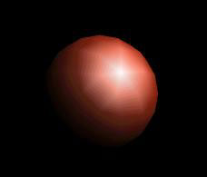
because the equations that govern VRML's color and lighting model add in some of the diffuseColor even on the brightest parts of the highlights, but you could change it to make the highlight a light pink instead of white if you want: The "star" effect is really an artifact of my VRML browser's converting the sphere to a polyhedron, and we happened to catch the light right on one of the vertices. Hard highlight or glow Now that looks pretty good, but I personally think the highlight looks a little harsh. That brings us to our last parameter for this lesson, shininess. By reading the VRML spec, I see that the default value for shininess is 0.2, which most of the time looks pretty good. So in our last two examples, when we didn't write anything for the value of shininess, the VRML browser set it to 0.2 for us. Here's a little hint for when you're doing advanced work with color and lighting: stop and think what the default values are. The spec requires a VRML browser to set any parameter you don't specify to the default browser. You can spend a lot of time trying to figure out why something looks a certain way, and all along it's a default parameter you didn't set, and therefore didn't think about. Let's decrease the shininess from the default of 0.2 to 0.1 on our apple:
and see what we get.
Go ahead and download that world because I want you to play around with the shininess number a bit. Here's a little quiz to see if you understand shininess and the few hints I've given about it so far:
To make the surface the highlight (specular) color everywhere an object is lit, you should set the object's shininess to: (a) 1 (the largest allowable value) If you guessed (a), you're like 99% of people new to 3D graphics and a sizeable percentage of people who're experienced in 3D graphics. If it's shinier, it should show more highlight, right? You're also dead wrong. Try it yourself and see. Here's why. Shininess refers to the surface. So did all the other parameters we talked about, but this time we're talking about the outermost couple of layers of molecules on the surface. If a surface is perfectly smooth and shiny, then all reflections from it should be in a straight line. You should see a highlight as a single point (at least on the surface of a sphere). As the surface gets duller, the light rays reflecting back from it get scattered around more and more, until a perfectly non-shiny surface should have the same color (the highlight or specular color) everywhere the surface is lit because of these scattered reflections. Is it realistic? No. Once you get down lower than a shininess of 0.1, realism throws up its hands and runs out the nearest exit. VRML puts some tools in your hands to make your worlds look the way you want them to. But some tools, like shininess, have sharp edges and you can cut yourself on them if you aren't careful. If you look at the difference between our second and third VRML examples above, you'll see that the surface in the second example (shininess 0.2) looked polished, while the surface in the third example (shininess 0.1) looked more wirebrushed. So for reasonable values of shininess, it even makes sense. So if you're looking for a dull surface, either don't specify any specularColor (which, according to the spec, defaults the specularColor to 0,0,0 -- black -- just as we did in our first VRML example), or make the specularColor close to your diffuseColor. I've also gotten some great looking results by making the specularColor darker than the diffuseColor and by making the specularColor some other color -- e.g., blue when the diffuseColor is orange.
I've given you three parameters to play with, and that number is small enough that I hope you will take a few minutes and play with them and see what kinds of effects you can achieve with just diffuseColor, specularColor, and shininess. Next time: transparency, emissive color, ambient intensity (the most neglected of the color parameters) and why we did all our examples so far with spheres.
[1] Or maybe tomatoes. [2] You probably already know that commas in VRML are optional and that VRML browsers treat them exactly like whitespace. I put them in these early examples because it makes the code look clearer. Thanks to Lisa Reid whose questions convinced me I'd better start the tutorials here. Copyright © 2000 by Bob Crispen. All rights reserved. |
||
| Current tutorials * Deploying Shout3D Previous tutorials 3D Links FAQs Some of the best 3D resources are available online!
What did we miss?
|

VirtuWorlds, VirtuWorld, VirtuPortal, and 3DEZine are Trademarks of VIRTUWORLDS LLC.
No unauthorized uses are permitted.
© VirtuWorlds 1999, 2000